

Back to all work
CAMPAIGN DESIGN
TUBORG - Off The Record
TUBORG - Off The Record
TUBORG - Off The Record
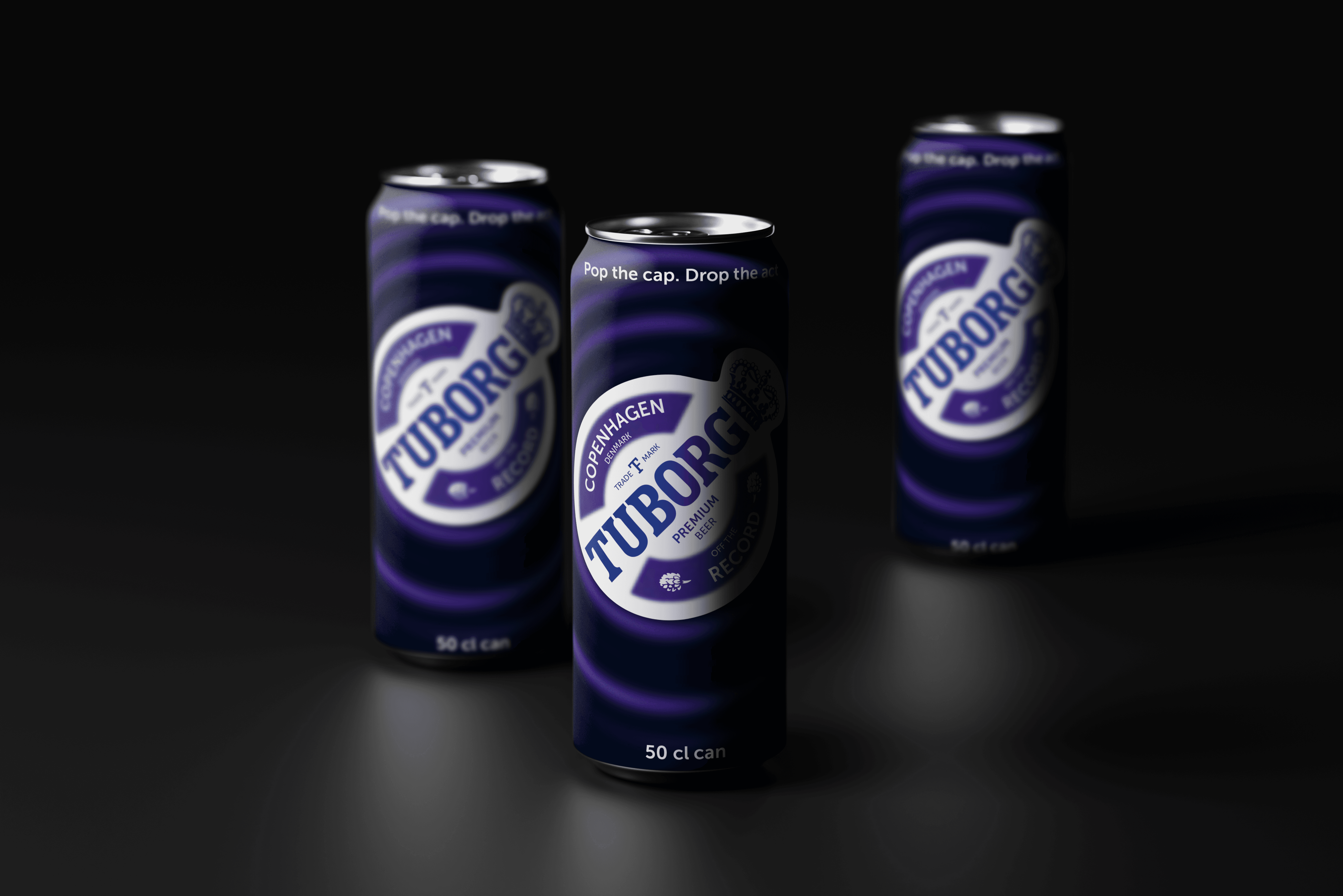
A bold, unapologetic campaign for Tuborg that turns up the volume on beer, music, and everything best left off the record.
A bold, unapologetic campaign for Tuborg that turns up the volume on beer, music, and everything best left off the record.
Client
D&AD Brief 2026
D&AD Brief 2026
Year
2026
2026
Discipline
Campaing and Experiential Design
Campaing and Experiential Design
Deliverables
Campaign | Packaging
Campaign | Packaging
BRAND OVERVIEW
BRAND OVERVIEW
BRAND OVERVIEW
Tuborg is a Danish beer brand rooted in youth culture, music, and social gatherings. Founded in 1880 near the docks of Copenhagen, a space defined by movement, people, and exchange. Guided by the belief “Stagnation is Decline”, Tuborg champions openness, progress, and cultural movement. The brand lives in real social moments, nightlife, gigs, festivals, and casual hangouts. Tuborg stands for release, not escape, encouraging people to let go of pressure without excess.
Tuborg is a Danish beer brand rooted in youth culture, music, and social gatherings. Founded in 1880 near the docks of Copenhagen, a space defined by movement, people, and exchange. Guided by the belief “Stagnation is Decline”, Tuborg champions openness, progress, and cultural movement. The brand lives in real social moments, nightlife, gigs, festivals, and casual hangouts. Tuborg stands for release, not escape, encouraging people to let go of pressure without excess.
Tuborg is a Danish beer brand rooted in youth culture, music, and social gatherings. Founded in 1880 near the docks of Copenhagen, a space defined by movement, people, and exchange. Guided by the belief “Stagnation is Decline”, Tuborg champions openness, progress, and cultural movement. The brand lives in real social moments, nightlife, gigs, festivals, and casual hangouts. Tuborg stands for release, not escape, encouraging people to let go of pressure without excess.

When did a night out become a performance?
When did a night out become a performance?
Young adults want to let go, but being seen has become part of the night. OFF THE RECORD is a Tuborg experience that takes the spotlight off the individual and puts it back on the group.
Young adults want to let go, but being seen has become part of the night. OFF THE RECORD is a Tuborg experience that takes the spotlight off the individual and puts it back on the group.


OFF THE RECORD
Pop the cap. Drop the act
TUBORG
OFF THE RECORD
Pop the cap. Drop the act
TUBORG
Negative Pressure

NEGATIVE PRESSURE
Narrow Down
Narrow Down
Narrow Down
I narrowed my research to social visibility and constant self-presentation. Shaped by social media, cameras, and peer judgment, social spaces have become increasingly performative, affecting authenticity and spontaneity. The campaign aims to offer a space that feels more present, freeing, and less performative.
I narrowed my research to social visibility and constant self-presentation. Shaped by social media, cameras, and peer judgment, social spaces have become increasingly performative, affecting authenticity and spontaneity. The campaign aims to offer a space that feels more present, freeing, and less performative.
I narrowed my research to social visibility and constant self-presentation. Shaped by social media, cameras, and peer judgment, social spaces have become increasingly performative, affecting authenticity and spontaneity. The campaign aims to offer a space that feels more present, freeing, and less performative.
Social spaces are meant for freedom, but have become stages for performance.
Social spaces are meant for freedom but have become stages for performance. Constant visibility and self-presentation prevent young adults from fully letting go, creating an opportunity for Tuborg to make nights out feel more authentic and judgment-free.

The Campaign
OFF THE RECORD
Pop the cap. Drop the act.
Campaign Idea:

The Campaign
OFF THE RECORD
Pop the cap. Drop the act.
Campaign Idea:
The Campaign
OFF THE RECORD
Pop the cap. Drop the act.
Campaign Idea:
MOODBOARD
MOODBOARD


Release
Bottle necktag
for Cue card
Gathering
Concentric
Circles
Noise
Diffuse
Colour Palette
Colour Palette
This palette balances bold brand confidence with high-energy expression. Deep blues anchor the identity in familiarity and trust, while electric purple adds mood and nightlife intensity. The lime and neon greens inject freshness, vibrancy, and youthful spontaneity.
This palette balances bold brand confidence with high-energy expression. Deep blues anchor the identity in familiarity and trust, while electric purple adds mood and nightlife intensity. The lime and neon greens inject freshness, vibrancy, and youthful spontaneity.
This palette balances bold brand confidence with high-energy expression. Deep blues anchor the identity in familiarity and trust, while electric purple adds mood and nightlife intensity. The lime and neon greens inject freshness, vibrancy, and youthful spontaneity.
#03184b
#7e3bed
#c4f331
#00f528
#002ea4

TYPOGRAPHY
MUSEO SANS
A B C D E F G H I J K L M N O P Q R S T U V W X Y Z
A B C D E F G H I J K L M N O P Q R S T U V W X Y Z
a b c d e f g h i j k l m n o p q r s t u v w x y z
a b c d e f g h i j k l m n o p q r s t u v w x y z
RIPPLE AS BRAND LANGUAGE


Used as a dominant hero element, fully occupying the space to create immersive impact.
Full Ripple (100%):
Placed along any edge to guide movement and create directional flow within the composition
Half Ripple (1/2):
Used as a subtle corner accent to frame layouts and add controlled visual energy.
Quarter Ripple (1/4):

Used as a dominant hero element, fully occupying the space to create immersive impact.
Full Ripple (100%):
Used as a subtle corner accent to frame layouts and add controlled visual energy.
Quarter Ripple (1/4):
Used as a subtle corner accent to frame layouts and add controlled visual energy.
Quarter Ripple (1/4):
RIPPLE AS BRAND LANGUAGE


Project Insight
My biggest takeaway from this project was understanding how deeply social environments shape behaviour. What feels like personal pressure is often built into the space itself. It’s not just about creating energy, but about designing moments where people feel comfortable enough to stop performing and simply be present.
VIEW NEXT

Pop-up Store
adidas X D.O.N.
Retail & Brand Environment | Collaborative Project

Publication Design
Ragas & Rhythms
Design for Print | Classroom Project
VIEW NEXT
Pop-up Store
adidas X D.O.N.
Retail & Brand Environment | Collaborative Project
Publication Design
Ragas & Rhythms
Design for Print | Classroom Project
Pop-up Store
adidas X D.O.N.
Retail & Brand Environment | Collaborative Project
Publication Design
Ragas & Rhythms
Design for Print | Classroom Project
TYPOGRAPHY
MUSEO SANS
A B C D E F G H I J K L M N O P Q R S T U V W X Y Z
a b c d e f g h i j k l m n o p q r s t u v w x y z
Used as a dominant hero element, fully occupying the space to create immersive impact.
Full Ripple (100%):
Used as a subtle corner accent to frame layouts and add controlled visual energy.
Quarter Ripple (1/4):
Used as a subtle corner accent to frame layouts and add controlled visual energy.
Quarter Ripple (1/4):
RIPPLE AS BRAND LANGUAGE